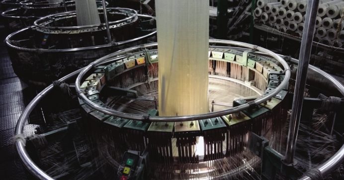
A woven sack plant produces a lot of data: weights at the tape line, roll weights at the looms, bag counts at stitching, bale weights at dispatch. Most of it is written down and never analysed. These six measures turn it into decisions.
1. Output and denier per tape line
Track kilograms per hour and average denier per shift for each extrusion line. Denier above the target means more resin in every metre of tape; denier below it risks weak fabric. Seeing both together, per shift, shows where the line needs attention.
2. Loom efficiency
Compare actual fabric output with what each loom could produce in the time available, and split the difference into stoppages by reason: tape breaks, bobbin changes, mechanical faults, no operator. Loom-wise and shift-wise views show whether the problem is a machine, a material or a team.
3. Fabric GSM and roll weight
Roll weight against length and width gives actual GSM. When actual GSM drifts above the specification, the plant is giving away material; when it drifts below, quality complaints follow.
4. Wastage by stage
Book waste where it happens: tape line start-up, weaving, cutting, stitching and printing. A single monthly wastage figure hides the cause; stage-wise figures point straight at it. Weigh the regrind that comes back so it can be reused and credited.
5. Fabric-to-bag yield
Reconcile fabric issued to cutting with bags produced. The gap is cutting waste, rejects and unrecorded material, and it is often larger than expected.
6. Cost per kilogram and per bag
Combine actual consumption of resin, filler, masterbatch, ink, thread and labour with output to get real cost per kilogram and per bag for each order. Compare it with the price quoted to see which customers and bag types earn their keep.
From registers to dashboards
None of this needs new data, only data captured consistently and in one place. When scales, looms and supervisors feed the ERP directly, these measures update as the plant runs, and the morning meeting starts with yesterday's numbers instead of last month's.
Build one page for the morning meeting
Analytics only helps if people look at it. Put the six measures on a single dashboard for the morning meeting: yesterday's output and denier per tape line, loom efficiency with the top three stoppage reasons, fabric GSM against target, wastage by stage, fabric-to-bag yield and cost per bag for the main orders. Keep it to what fits on one screen.
Compare shifts fairly
Shift comparisons cause arguments when they are unfair. Compare like with like: the same product, the same machines and similar run lengths. A shift that handled three colour changes will always look worse on output than one that ran a single product all night, so show changeovers next to the output figure.
From numbers to actions: an example
Suppose the dashboard shows that one tape line runs above the target denier on most night shifts. The data points to the cause: start-up after the evening changeover is not brought back to target. The action is a simple one, a denier check before releasing the line after every changeover, and the next week's figures show whether it worked.
Get the data right first
Analytics is only as good as the data behind it. Before building charts, make sure every roll has a number and a weight, every stoppage has a reason, and every waste bag is weighed and booked. Weighing scales connected to the ERP and barcode labels on rolls and bales remove most of the errors that make reports untrustworthy.
Formezy's Business Intelligence module builds these views from the same records production creates. Book a demo to see them on your own data.